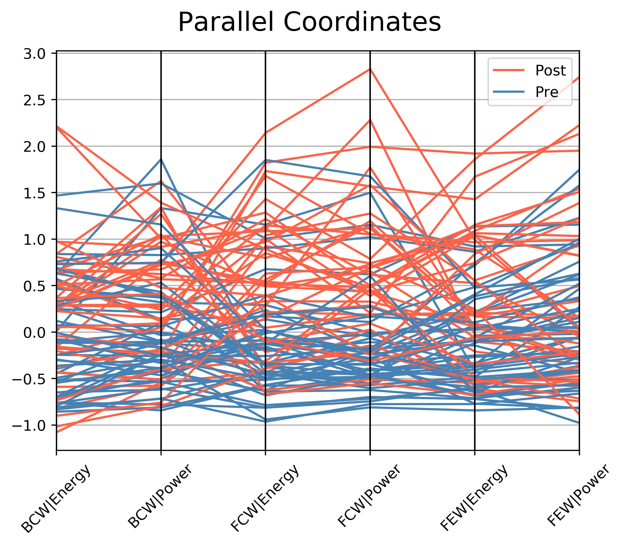
Parallel Coordinates
Each patient's set of data is represented as a single connected line segment. That is, each line corresponds to a row in the dataset and the color shows which class that row belongs to.
Each vertical line on the x-axis represents one data attribute (variable), for example FEW_Energy. Hence points that tend to cluster will appear closer together.
The order of the x-axis and in effect the route which each patient's line segment takes can also give information on inter-relationship between variables.
The data for each column has been 'scaled' - known as Feature Scaling, because each column of values is of differing magnitudes and units.
Scaling allows them to be compared. Because most of this data is not normally distributed, 'standard scaling' is not appropriate as this assumes a normal distribution.
The data for the above plot has undergone 'robust scaling', which accounts for outliers and non-normally distributed values. The y-axis units are purely relative to one another and have no units.
This plot attempts to provide class separation in each variable.
For example FCW_Energy and FCW_Power are generally greater post-TAVR, which postulates whether these variables could be used to classify other invasive data as being pre or post-TAVR.

Plot of pairwise relationships: Kernel density estimates in 2-D (density plots), univariate distributions and linear regression scatter plots
The diagonal shows the distribution of a single variable as bar plots.
Upper and lower triangles show the relationship (or lack thereof) between two variables.
The upper triangle is a scatter plot which has had a linear regression model fit and shaded confidence intervals. The r values are the Pearson's correlation coefficients, not the gradients.
The lower triangle is a plot of bivariate density in the form of a 2-dimensional kernel density estimate (the more data points in a given area, the darker the colour).
In effect, the upper and lower triangles are exactly the same data, just plotted in different formats with the x and y axes also reversed.
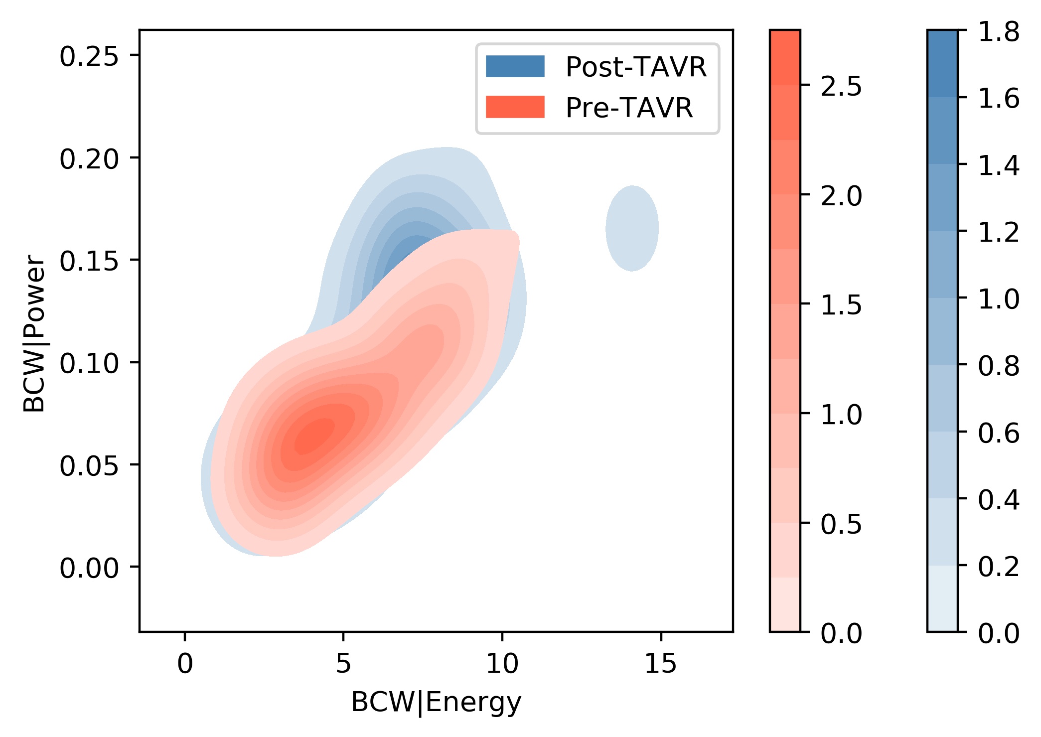
2-dimensional kernel density estimates with absolute density colour bars
These are the absolute density values for each of the colours depicted by the density cloud.
In other words, plotting this data as a probability density function, it would be the height of the graph at that data point.
This allows for comparison of 'how dense' the clouds are.
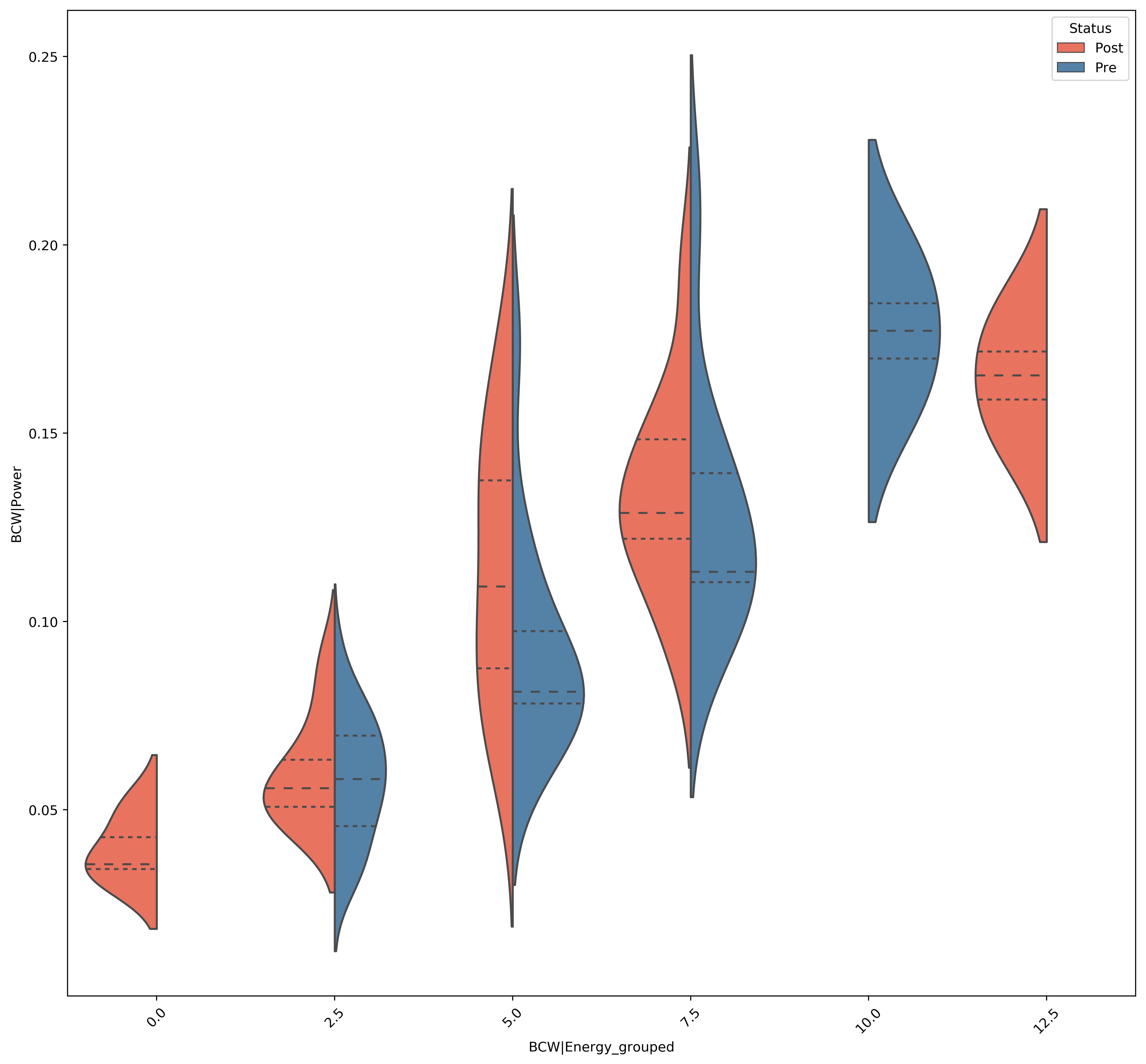
Split Violin plots
A violin plot is a statistical representation which plays a similar role as a box and whisker plot and can be an effective and attractive way to show multiple distributions of data at once.
It shows the distribution of quantitative data across several levels of one (or more) categorical variables such that those distributions can be compared.
Unlike a box plot, in which all of the plot components correspond to actual datapoints, the violin plot features a kernel density estimation of the underlying distribution.
The estimation procedure is influenced by the sample size, and violins for relatively small samples might look misleadingly smooth.
X-axis values have been sorted into ranges (for example 0-10, 10-20 etc..) so that a plot didn't need to be made for each unique value.
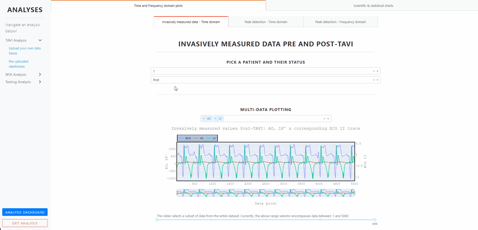
Invasively measured data pre and post-tavr - Time domain
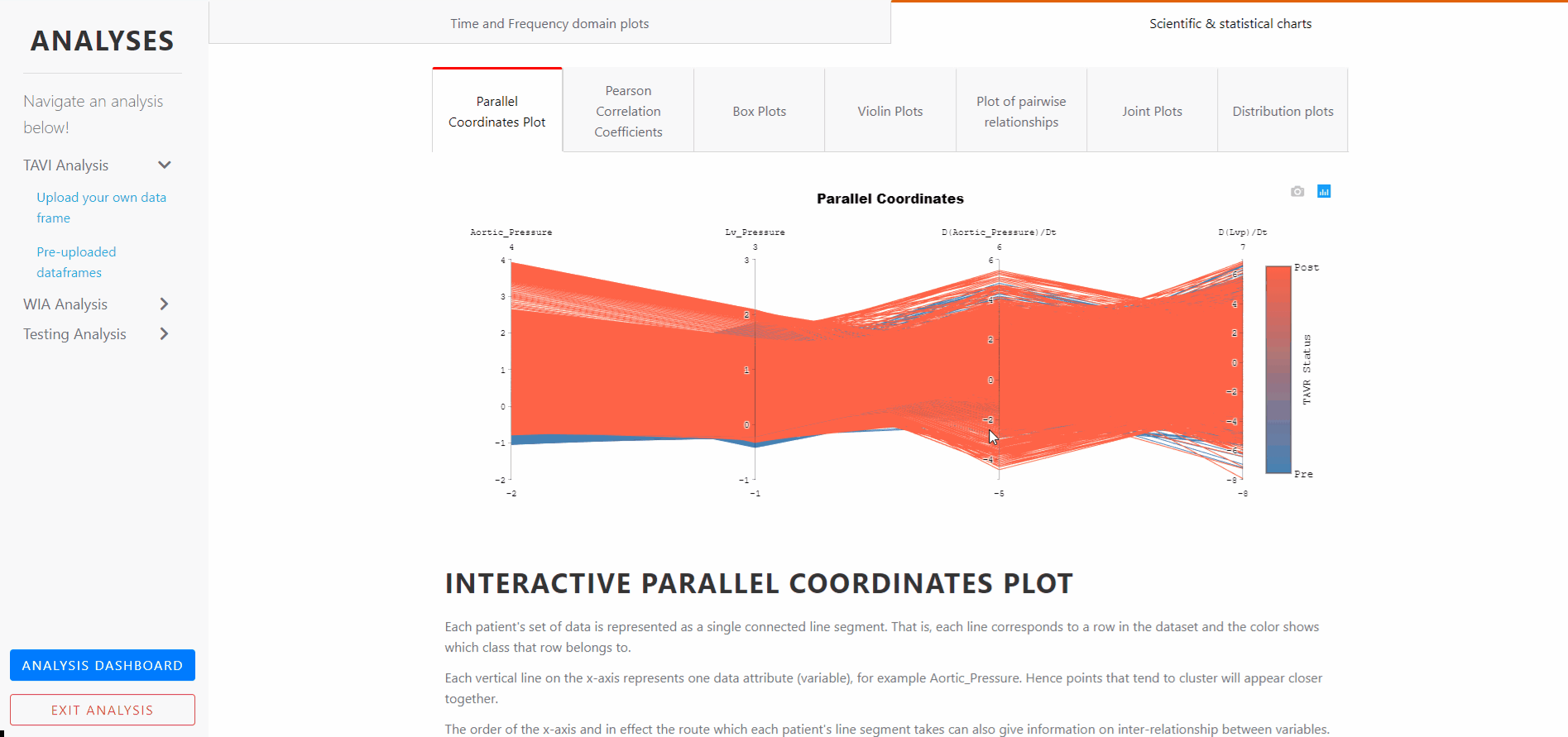
INTERACTIVE PARALLEL COORDINATES PLOT
Each patient's set of data is represented as a single connected line segment. That is, each line corresponds to a row in the dataset and the color shows which class that row belongs to.
Each vertical line on the x-axis represents one data attribute (variable), for example Aortic_Pressure. Hence points that tend to cluster will appear closer together.
The order of the x-axis and in effect the route which each patient's line segment takes can also give information on inter-relationship between variables.
The data for each column has been 'scaled' - known as Feature Scaling, because each column of values is of differing magnitudes and units.
Scaling allows them to be compared. Because most of this data is not normally distributed, 'standard scaling' is not appropriate as this assumes a normal distribution.
The data for the above plot has undergone 'robust scaling', which accounts for outliers and non-normally distributed values. The y-axis units are purely relative to one another and have no units.
This plot attempts to provide class separation in each variable.
For example Aortic pressure is generally greater post-TAVR, which postulates whether this variable could be used to classify other invasive data as being pre or post-TAVR.
The plot is interactive. The axes can be reordered by dragging horizontally, and interconnectedness explored between the classes and how this affects the class separations. That is, the order in which the axes are arranged can impact the way how the reader understands the data.
One reason for this is that the relationships between adjacent variables are easier to perceive, then for non-adjacent variables. So re-ordering the axes can help in discovering patterns or correlations across variables.
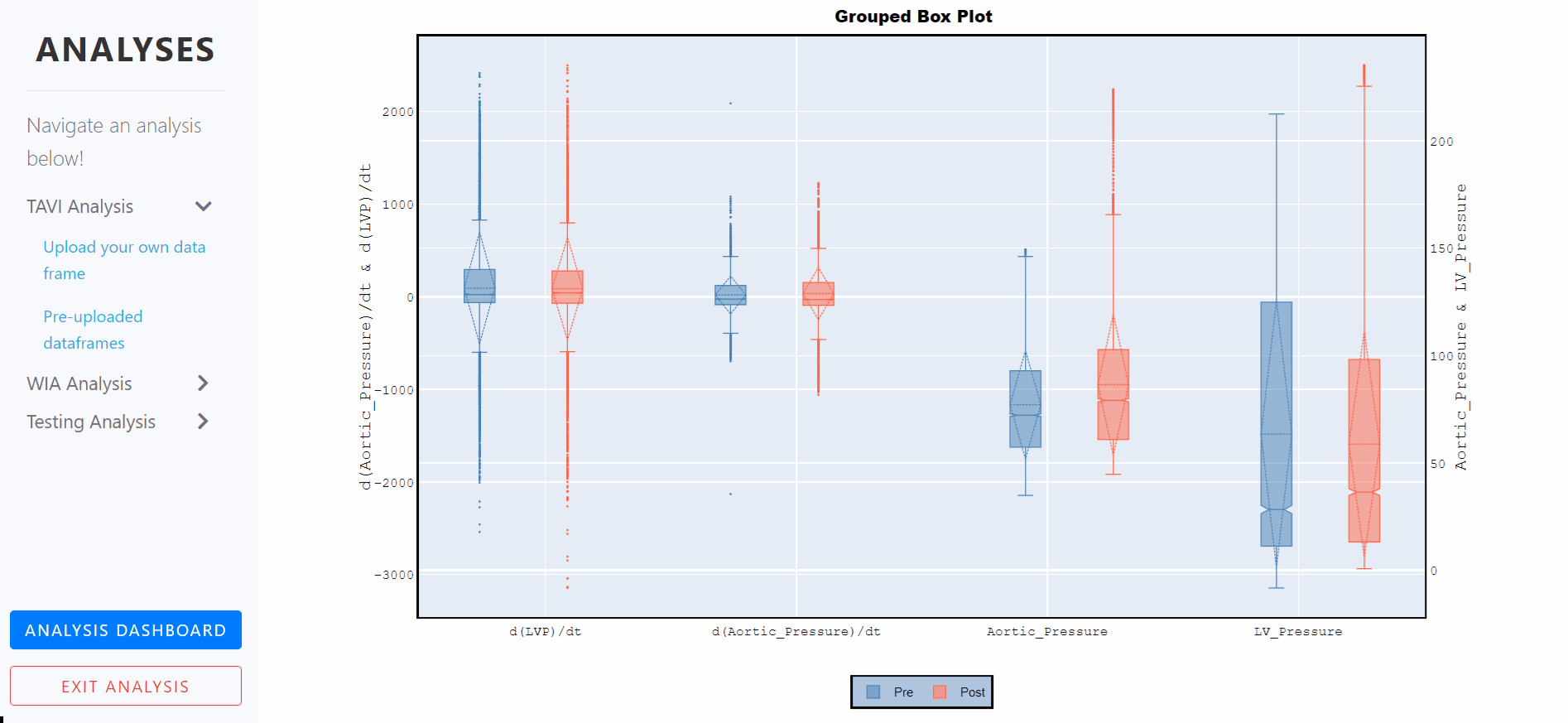
Box Plots - Grouped, notched and with standard deviations
A box plot is a statistical representation of numerical data through their quartiles. The ends of the box represent the lower and upper quartiles, while the median (second quartile) is marked by a line inside the box.
Notched box plots apply a 'notch' or narrowing of the box around the median. Notches are useful in offering a rough guide to significance of difference of medians; if the notches of two boxes do not overlap, this offers evidence of a statistically significant difference between the medians.
The mean of the underlying distribution is drawn as a dashed line inside the boxes, and the the standard deviation is also represented by the dashed diamond.
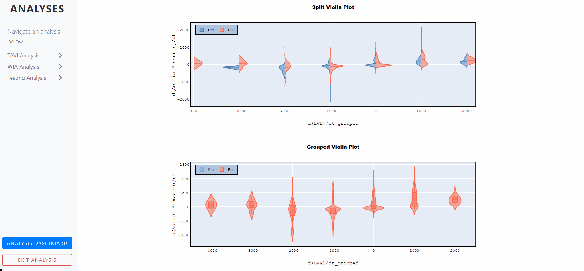
Violin Plots - Split and Grouped
A violin plot is a statistical representation which plays a similar role as a box and whisker plot and can be an effective and attractive way to show multiple distributions of data at once.
It shows the distribution of quantitative data across several levels of one (or more) categorical variables such that those distributions can be compared.
Unlike a box plot, in which all of the plot components correspond to actual datapoints, the violin plot features a kernel density estimation of the underlying distribution.
The estimation procedure is influenced by the sample size, and violins for relatively small samples might look misleadingly smooth.